Candle Range - Monthly - Open/High/Low/Close/Wicks (Oldinvestor)This candle range comparison is similar to my original script Candle Range Compare .
This script is to compares the size of open/close high/low and wick size side by side. This version of the script allows you to only show a chosen month of each year to compare. I hadn't even thought to try and vanish the part of the chart I'm not looking at. I'll consider that later (may never happen, I am limited on time).
I have also included check boxes to turn on/off certain candles. This part is pretty self explanatory. For example: if you wish to not see wicks in front of the open/close, go to the settings for the study and uncheck the box for "Show Wicks".
Warning: The script does not work so well on monthly candles? Some of the candles are missing...
Good luck
Oldinvestor
在腳本中搜尋"high low"

Custom Time ranges. Daily price ranges.Addition to previous time range script, now containing daily ranges. You can select a day of the week, and have it show the high, low, mid, and open of that day.
For the time bands:
Monday = 2
Tuesday = 3
Wednesday = 4
Thursday = 5
Friday = 6
Saturday = 7
Sunday = 1
Example 1:
1500-1800:2
This will colour the background between 3pm and 6pm on Mondays.
Example 2:
0000-0600:247
This will colour the background between midnight and 6am on Mondays, Wednesdays, and Saturdays.
For the Daily price ranges:
Just select the tick-box forthe day, and then the price levels you'd like to see.
I want to add specific weekly levels to this, for example: week 06 of year 2020, but I've not figured out how to do it yet. If anyone knows, I'd appreciate it if you let me know. I'll then update this script.
As always, any questions you may have, please leave in comments below and I'll respond when I have time.
If you notice anything good with this indicator, let me know. We are all in this to make money after all! ;)

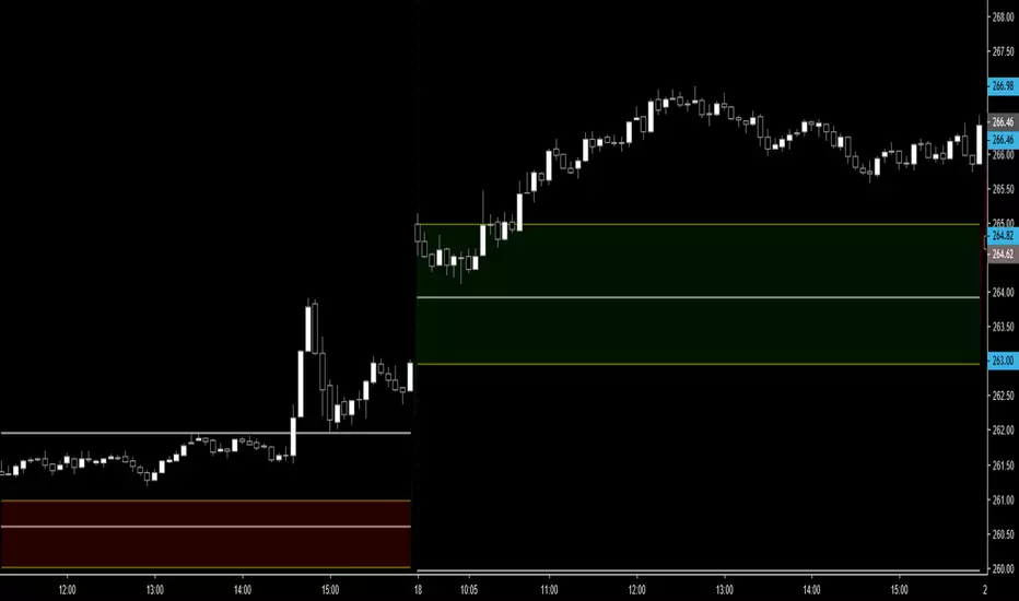
MB DAILY CPR, HIGH, LOW, RESISTANCE AND SUPPORTThis script is based on Franklin O. Ochoa's "Secrets of a Pivot Boss". This script shows daily CPR with R1 to R4 and S1 to S4, previous day high, low, This script mostly works for swing, scalping and intraday.
Recommended to back test before use.
By using this script I will not accept liability for any loss or damage, including without limitation any loss of profit.

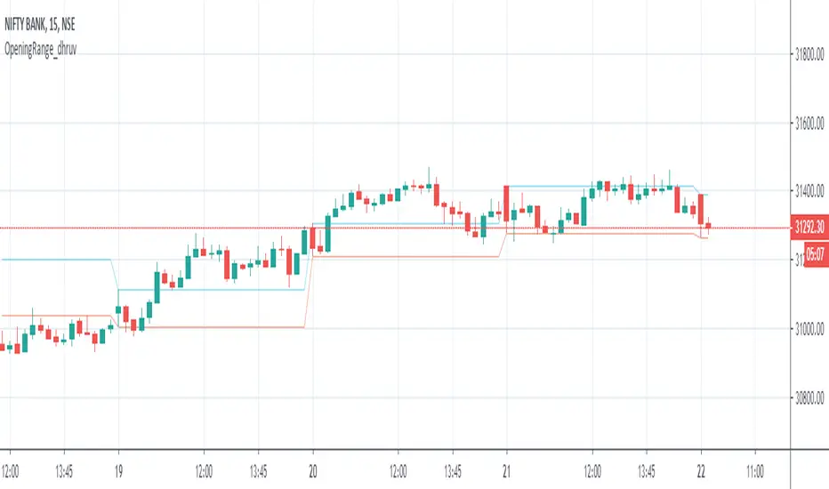
Opening Range_dhruvHello Traders ..
this is the strategy for opening range 15 min high low auto marking tool
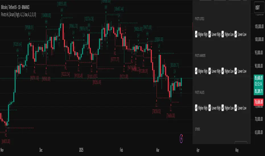
Pivot Points High Low (HH/HL/LH/LL) [Anan]Hello Friends,
This is my own version of ( Pivot Hilo Support n Resistance Levels R3-3 by JustUncleL )
- V4 Pinescript
- Removed MA dependency filters
- Add some arrows

Previous OHLC LevelsQuick dirty code for personal use. Plots previous OHLC levels based on a selected time-frame on the chart.
Not bad if you want to see different time-frame levels.
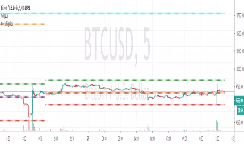
Fill function can serve to highlight the daily range (high-low or open-close) on non-standard charts
Uses base code from JayRogers

Open-high-lowmodified @traderXO's original daily open/high/low script to include monthly and weekly open.
Standard Deviation using high, low, closeEvery standard deviation tools just only consider one source to compute std, but this tool also consider close, high, low to publish std

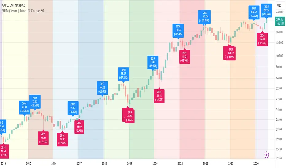
Yearly High/Low MarksAn utility tool for analysts. It marks the highest and lowest prices for each year down to 1989.
Works everywhere and doesn't use any calls of built-in functions that relate to the data extraction.
AAPL, D
AAPL, M
BLX, D
BLX, W
BLX, M

Pivot High Low Pointsby using this script you can find Pivot High-Low Points. This script works like Tradingview pivothigh & pivotlow functions.
If you find my works useful, please consider a donation
BTC: 16XRqyS3Vgh1knAU1tCcruqhUrVm4QWWmR
by LonesomeTheBlue

Volume Weighted High / Low IchimokuSame Idea as standard Ichimoku except using volume-weighted average high / low for the corresponding periods. adjustable displacement / time period inputs.
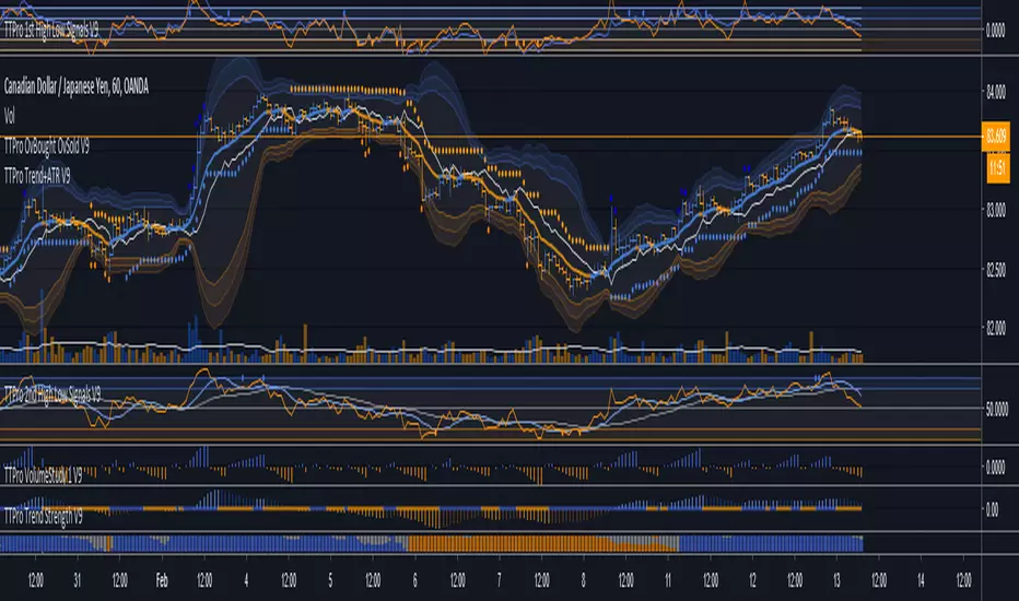
TTPro 2nd High Low Signals V9// TTpro High Low Signals 2nd indicator is a versatile leading indicator designed to identify optimal entry and exit points, overbought and oversold signals, and its also useful in identifying trends. When the signal line is above the mid level, trend favors the bulls and when the line is below the mid level, the trend favours the bears. Bullish and bearish divergences can be used to detect early momentum shifts and anticipate trend reversals also. Visit www.turbotraderpro.com for more details.

TTPro 1st High Low Signals V9TTPro 1st High Low Signals is a leading indicator that can identify trends, anticipating trend reversals and highlights overbought and oversold levels. It is also useful in identifying bullish and bearish divergences and detecting early momentum shifts.
Current Open/Previous High Low Close. Gap HighlightedThis script plots the current open previous high low close. Also the area between the current open and previous close are highlighted to easily see the overnight gap. The idea is that after a significant gap the price will retest previous days levels before continuing in the direction of the gap.
Poseidon - [Swing High Low][Support and Resistance][Reversal]...A great indicator with tons of usages for technical analysis
Act as:
* Support and Resistance (It can be used as breakouts only if you drag the line manualy, it will never break it by itself)
* Swing points
* Reversal point (The candle will reverse in 90% in cases)
* Tops and Bottoms (It finds highest and lowest points)
... and many more TA for strategies
Combined with RSI will give even better overview of the chart
Play with values till you find what your needs are
The bigger value is, the more accurate points will be
(There is no such as magic indicators, you need to do your job, you need to know what are you doing before enter in real life!)
Cheers!
@Zekis

New Highs-Lows AMEX-Buschi
English:
This indicator shows the AMEX's up volume (green) and down volume (red).
Extreme trading days with more than 90 % up or down volume are marked via lines (theoretically values) and triangles (breaches).
Deutsch:
Dieser Indikator zeigt das Aufwärts- (grün) und Abwärts-Volumen (rot) der AMEX.
Extreme Handelstage mit mehr als 90 % Aufwärts- oder Abwärts-Volumen ist gekennzeichnet über Linien (theoretische Werte) und Dreiecke (Überschreitungen).
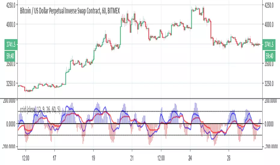
ccid (with high low histogram)So this indicator has the following : CCI where the buy and sell signal can be either cross of the fast the slow and vice versa or cross of CCI bellow -50 and cross down CCI +50
the histogram (blue and red) is made by high low like histogram the buy and sell is based on crossing of the 0 . since its MTF type . you can toon the TF either to the time frame or use lower graph time with higher TF
since both indicator complement each other then I put them together
Previous 2Days High/LowTesting simple range of highs/lows of previous 2 days, for reference, working on every timeframe.

Previous High/Low Current OpenDisplays
Previous Monthly/Weekly/Daily High/Low over current prices
Current Monthly/Weekly/Daily Open over current prices

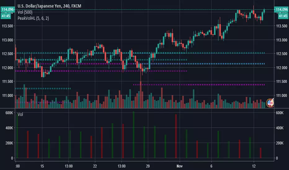
LKK Peak Volume High Low PriceThis indicator will plot the high/low price of highest intraday volume of highest day volume.
The first input to specify number of bars back and forward to locate the highest volume day.
The second input need to specify current intraday chart have how many bars per day.
Last input is to specify how many plot to extend the plotting to last bar.